

Season 2 premiere: Why Does Everything look the same?
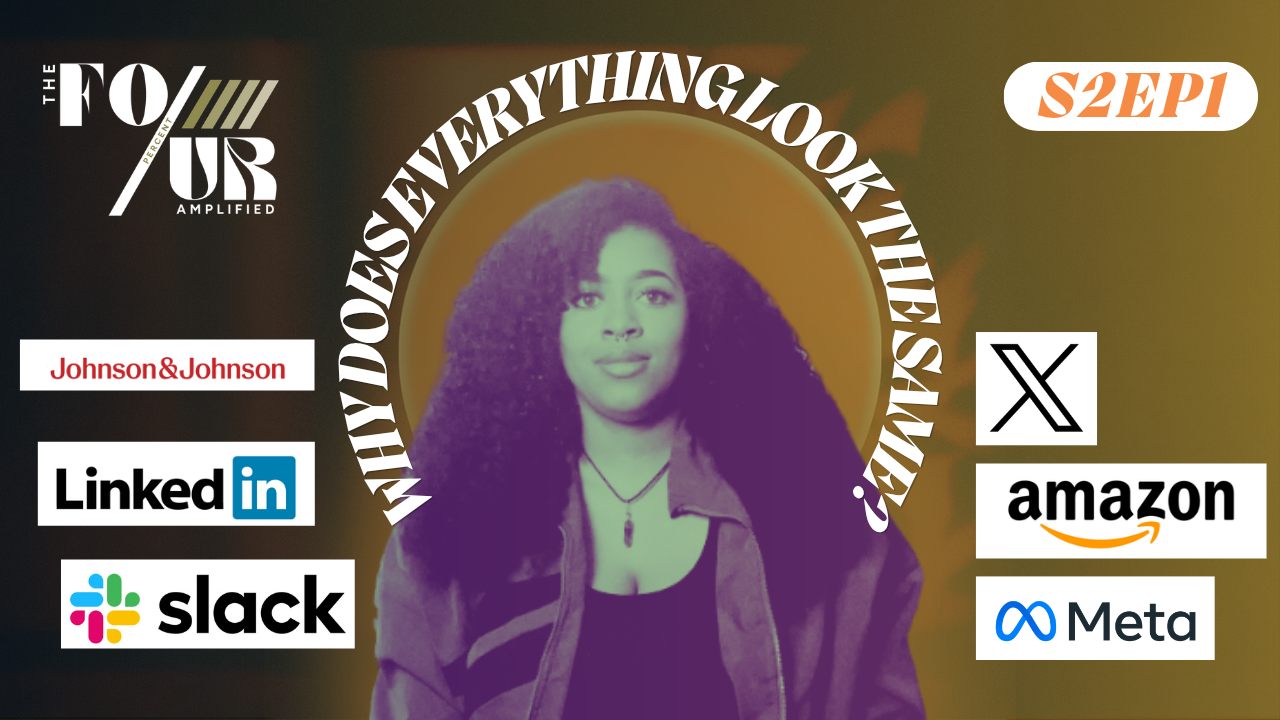
Season 2 of The Four Percent Amplified opens with the question I couldn't stop asking for months: Why Does Everything Look The Same?
Every "modern" brand seems to run the same three fonts, the same pastel palette, the same layout template. Every rebrand starts to look like the last rebrand. In this episode, the first of a season titled Shifting Perspective, I take a full-episode look at how we got here, what AI is doing to accelerate the flattening, and the brands still refusing to blend in. If you've been quietly noticing the same thing, this one's for you.
Watch & Listen to the Episode
about this episode
There was a time when brands had decades to build a personality. A logo meant something. A storefront felt like the city it lived in. A magazine had a voice you could recognize without seeing the cover.
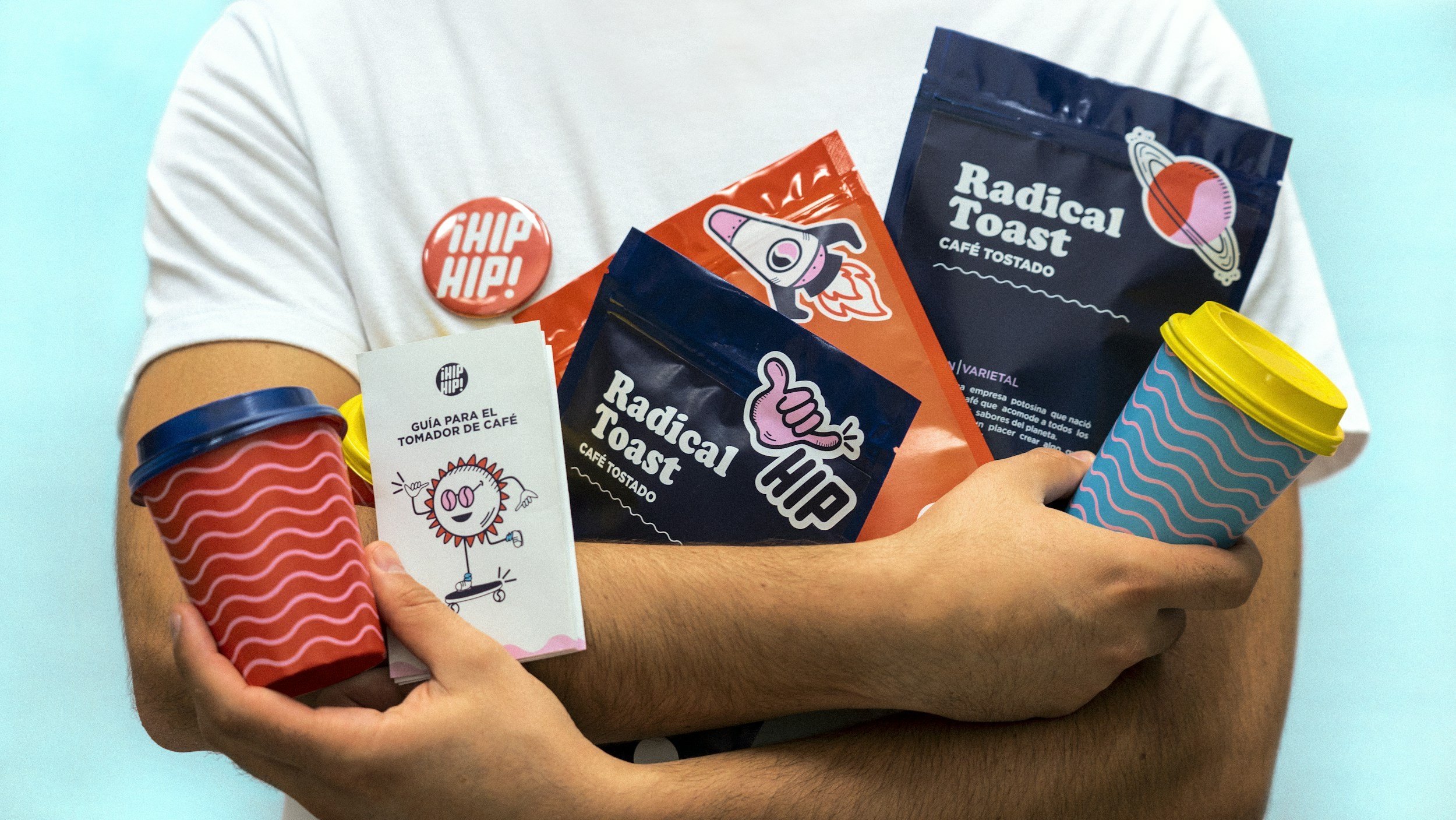
Now, every design decision looks like a Canva template. Every brand identity a slight variation on the same aesthetic. Everything looks the same because everything is being made the same way: fast, algorithm-optimized, borrowed from templates, refined by AI.
Episode 1 unpacks that shift, names its causes, and points to the brands that refuse to play along.
in this episode
The era when brands had decades to build a personality
How trend cycles shifted from years to weeks
What AI is doing to accelerate the flattening
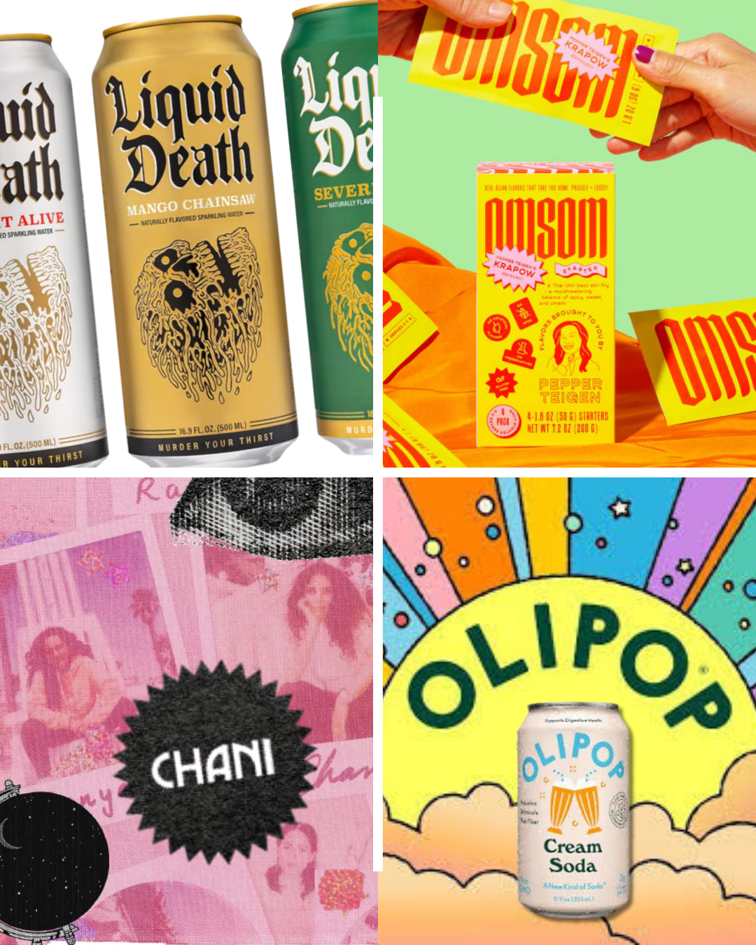
The brands doing it right: Liquid Death, Omsom, Olipop, Chani
The metaphysical side of design (a brand is an energy, a vibration)
Where creative work goes from here
Key Takeaway
“The best brands didn’t wait for the algorithm to tell them who to be. They built something the algorithm now follows.”
brands mentioned
Modern brands doing it right:
Liquid Death — the water brand marketing itself like a metal record
Omsom — the Asian food brand refusing to soften
Olipop — the soda brand turning nostalgia into modern flavor
Chani — the astrology brand built on intention, not trend cycles
Historical commercials referenced:
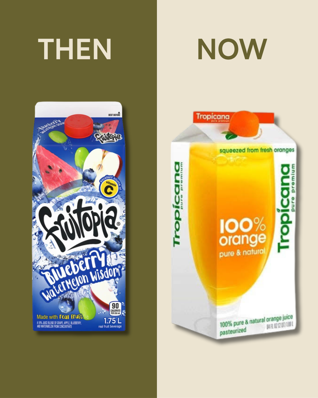
Fruitopia (Coca-Cola, 1994–2003)
Coca-Cola "Starry Eyed Surprise" (2001)
AOL Commerical (2002)
But wait there's more
〰️
But wait there's more 〰️

Stay in the Frequency
The energy doesn’t end when the episode does. Take what resonated, sit with it, and keep exploring:
From The Blog:
Julie Zhuo in UX Design: Principles That Shaped Meta
Keep Listening:
→ Ep 11: Color Outside The Algorithm
→ Ep 12: Humanity Beyond The Screen
Get Insights Delivered:
Tap & Subscribe to Amp’dIn on Substack
Keep listening, keep building, keep evolving.
We’re just getting started!
